Editing elements & the inspector
Select an element and change it in the Content, Design and Behaviour tabs.
On this page
The inspector is the settings panel, next to the build panel on the left of the editor. You can also dock it on the right, or let it float anywhere. It shows the settings of the element you select. Every change shows on the canvas at once and becomes part of your page when you save.
Move the inspector
The inspector sits next to the build panel by default. To put it somewhere else:
- Float it: click the grip ⠿ at the left of the inspector's header. The panel lifts off and floats over the canvas, which takes the free space.
- Move it: drag the grip, or the header of a floating panel, anywhere on the screen. Make a floating panel taller or shorter with the corner at its bottom right.
- Dock it again: drag it to the left or right edge until a dashed outline shows where it will go, then let go. Double-clicking the header of a floating panel docks it back on its last side.
- Choose a position: click the panel icon next to the search icon in the header and choose Dock left, Dock right or Float.
With the keyboard, focus the grip and press Enter to float the panel, then the arrow keys to move it (Shift moves it farther). While dragging, Esc puts it back. The position is saved in this browser. You can also set it in Editor preferences (Settings panel) or the command palette.
Pop-ups such as the color picker or Typography open beside the inspector, on the side of the canvas.
Select an element
- Click it on the canvas. A click selects the innermost element under the pointer; press Esc to select its parent.
- Click its row in Layers.
- Click a step in the path bar at the bottom of the canvas, for example Page / Hero / Heading. Click Page to clear the selection.
- Use the keyboard: Enter selects the first child, Tab the next element at the same level. See Keyboard shortcuts.
The selected element gets a toolbar with its name, Parent (select the parent), Move (drag to move), Duplicate, Delete and … (more actions). You can also press on any element in the canvas and drag it to a new place.
With nothing selected, the inspector shows the page name, the number of elements, and buttons for Insert elements and Page settings.
The three tabs
| Tab | What you find there |
|---|---|
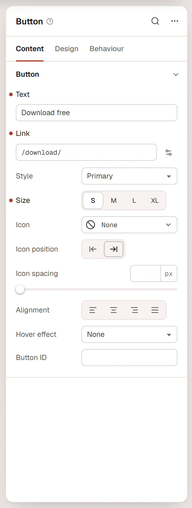
| Content | What the element shows: text, images, links, items, and options such as the HTML tag. For a container: its layout. |
| Design | How it looks: typography, colors, backgrounds, borders, then Spacing & position, Background & border and Mask for every element. At the top you can apply classes. |
| Behaviour | How it acts: Anchor & classes, Animations, Motion & effects, Scroll & mouse effects, Visibility, Conditions, Interactions and Attributes & CSS. |
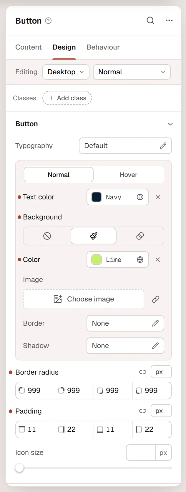
Settings are grouped in sections that open and close. A closed section shows a short summary of what is set in it, or Default. The ? next to the element's name explains what the element is for.
If your role can edit content only, you see just the Content tab. See Roles & access.
Edit for a device or a state
At the top of the Design and Behaviour tabs, the Editing row shows what you are changing:
- Device: Desktop, Tablet or Mobile. It is the same as the device buttons in the top bar. On Desktop your change applies to all widths. On a smaller device a hint under the row says how far it reaches, for example Changes apply to Tablet and smaller. See Responsive editing.
- State: Normal, Hover, Focus, Pressed, ::before, ::after or Custom selector…. In a state, only the settings that can change in that state are shown. See Hover & other states.
Read the dots next to a setting
In the margin left of a setting's label, a small dot tells you where its value comes from:
- Filled dot: set here, on this device. The label is darker too. Click the dot to reset the setting.
- Hollow dot: inherited from a larger device, for example the Desktop value while you edit Tablet.
- No dot: the default.
Hover a dot to read it, for example Set on Desktop · click to reset or Inherited from Desktop. The same dots work inside pop-up editors such as Typography, in the Normal and Hover boxes, and in list items.
How a setting row reads
- Most settings show the label on the left and the field on the right.
- A setting with a long name, or a large field such as a text area, a link, an image or a list, shows the label above the field.
- A slider shows the label and the value on one line, and the slider below it.
- An on/off switch sits at the right of its label.
- ? next to a label explains the setting. Hover it, or move to it with Tab, to read the explanation.
Useful buttons in a setting row
These buttons appear at the end of the label line when you point at the row or move into it with the keyboard. They stay visible while their menu is open.
- { } (Use a design variable) on size and spacing fields: pick a value from your Design System sizes. The field then follows the variable.
- The database icon (Dynamic data) on fields that can show live content, such as the post title or a custom field. See Dynamic tags.
- The sparkles icon (AI writing) on text fields, when AI writing is set up. See AI in the editor.
- Color fields open a color picker with your Site colors, recent colors, an opacity slider and a text field for any color value.
Find a setting
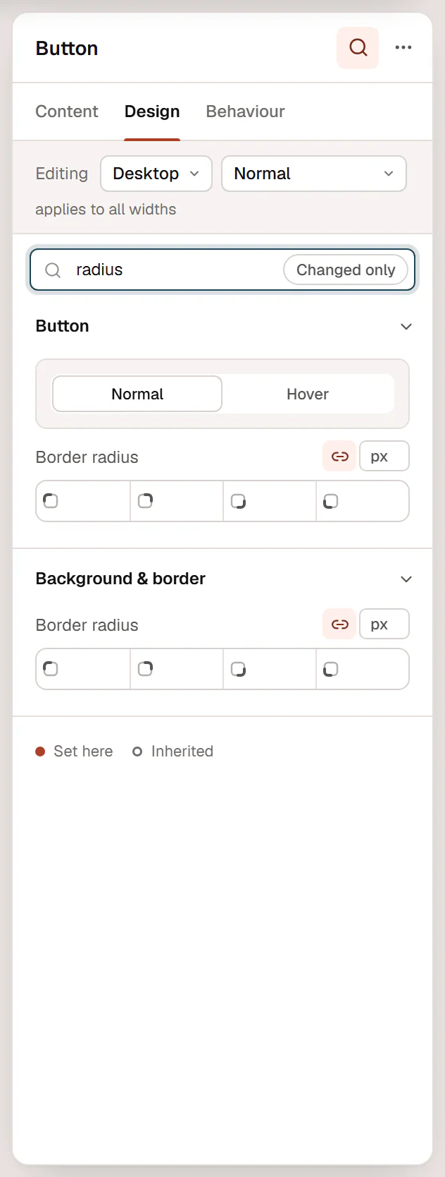
Click the magnifier (Search settings) in the inspector header and type, for example radius. The search looks through all three tabs at once. Turn on Changed only to list only the settings that have a value on this element, which is a quick way to see what makes it look the way it does.
Edit several elements at once
Hold Shift or Ctrl and click elements on the canvas or in Layers to select more than one. The inspector then edits them together:
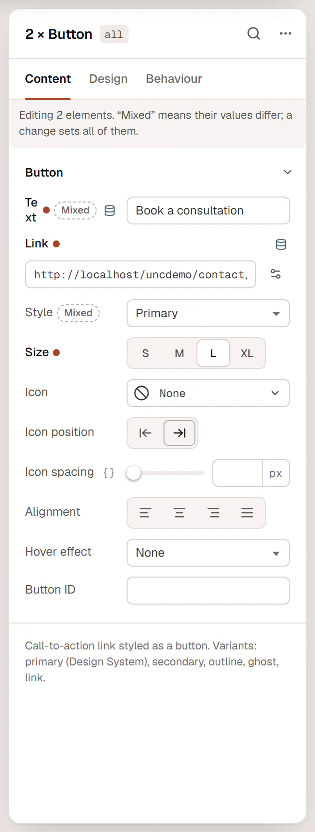
- Elements of the same type show all their settings, with the title 2 × Button.
- Mixed types show only the settings they share, with the title 3 elements.
- A field that differs between them shows Mixed. Changing it sets the same value on all of them.
Element actions
Click … (Element actions) in the inspector header, or right-click the element, for actions such as Copy, Paste style, Duplicate, Wrap in container, Add note…, Save as template, Lock and Delete. See Copy, paste & duplicate.
A locked element shows Locked: it cannot be moved, deleted or edited. with an Unlock button.