Page settings
Title, page template, header behaviour, background, scroll snap and page CSS.
Page settings apply to the whole page (or post, or template) you are editing, rather than to one element: its title, its page template, whether the header is transparent on it, its background, scroll snapping and extra CSS.
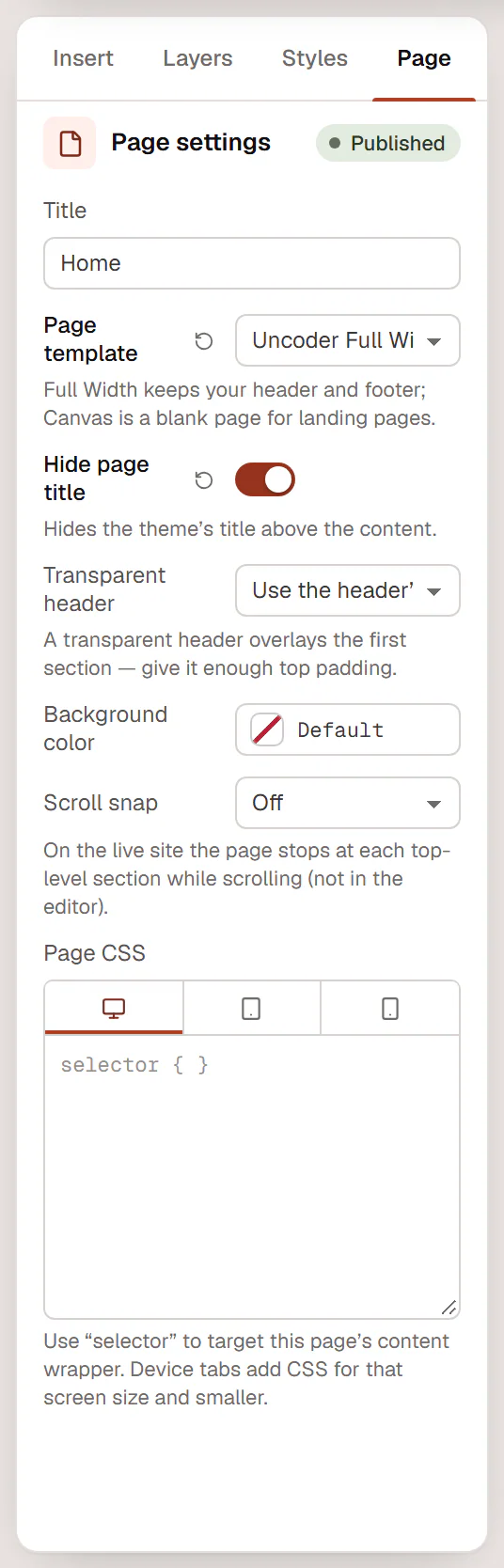
Open the page settings
- Click the fourth tab of the left panel. It is named after what you edit: Page, Post, Header, Footer, Popup, Section or Template.
- Or open the Uncoder menu and choose Page settings (Post settings, Header settings…).
- Or click Page settings in the inspector when nothing is selected.
The panel header shows the status of the page, for example Published or Draft. Changes are saved with the page, when you click Update or Publish.
Pages and posts
| Setting | What it does |
|---|---|
| Title | The page title, used in the browser tab, in menus and in search results. |
| Page template | Theme default, Uncoder Full Width or Uncoder Canvas (no header/footer). Full Width keeps your header and footer and gives the content the full width of the screen; Canvas is a blank page for landing pages. After changing it, save and reload the editor to see the new template. |
| Hide page title | Hides the title that your theme prints above the content. Turn it on when the page has its own heading. |
| Transparent header | Use the header’s setting, Transparent on this page or Solid on this page. A transparent header overlays the first section, so give that section enough top padding. |
| Background color | The background of the page content. |
| Scroll snap | Off, Gentle (when close to a section) or Always (one section at a time). On the live site, the page stops at each top-level section while visitors scroll. |
| Snap to | With scroll snap on: Top of the section or Middle of the section. |
| Page CSS | CSS for this page only. See below. |
Scroll snap works on the live site only, not in the editor, and is turned off for visitors who prefer reduced motion. It suits pages made of full-screen sections, such as a portfolio or a product story.
Page CSS
Write CSS that applies to this page only. Use selector to target the page's content wrapper:
selector h2 {
  text-wrap: balance;
}
The device tabs above the field add CSS for that screen size and smaller: CSS in the Tablet tab applies to tablets and phones. Page CSS is only available to users who may add code to the site (administrators, by default). For CSS on one element, see Custom CSS & attributes; for site-wide code, see Custom code.
Header templates
When you edit a header in the Theme Builder, the Header tab has the header behaviour settings.
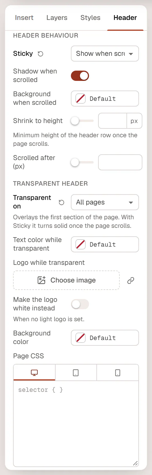
Header behaviour
| Setting | What it does |
|---|---|
| Sticky | Off — scrolls away, Always visible, or Show when scrolling up (hides while visitors scroll down and comes back when they scroll up). |
| Shadow when scrolled | Adds a shadow once the page has scrolled. On by default. |
| Background when scrolled | A background color once the page has scrolled, for example to make a transparent header solid. |
| Shrink to height | The minimum height of the header row once the page scrolls (40–160 px). |
| Scrolled after (px) | How far visitors scroll before the header counts as scrolled. Default 10 px. |
Transparent header
| Setting | What it does |
|---|---|
| Transparent on | Nowhere, All pages, Front page or Pages that turn it on. The header overlays the first section of the page. With Sticky, it turns solid once the page scrolls. |
| Text color while transparent | The color of menu links and text while the header is transparent. White by default. |
| Logo while transparent | A second logo, for example a white one, that the Site Logo widget shows while the header is transparent. |
| Make the logo white instead | Turns the normal logo white when you have no light logo. |
Each page can override the header with its own Transparent header setting (see the table for pages above).
Other templates
- Display conditions: headers, footers, single and archive layouts, the search results and 404 pages, and popups show where their conditions say. The panel lists the current conditions and has a button to Add conditions or Edit conditions. See Display conditions.
- Preview with: single layouts and loop items show the content of a post while you design. Choose which post; leave it empty to use the latest one.
- Popup: popups have their own section with layout, closing, triggers and frequency settings. See Create a popup.
- Component properties: saved sections can expose settings that each copy may change. See Components.
Every template also has Title, Background color and Page CSS.